Compare CPU Utilization Between Databases
You can compare CPU usage across multiple databases by clicking the Aggregate tab. Viewing the summary of resource utilization across all databases lets you identify points in time where there may have been unexpected spikes in resource utilization.
Aggregate Treemap
When the Aggregate tab is selected in the CPU Details page, the top half of the page displays a treemap of all databases enabled for Ops Insights in the compartment. By default, the chart shows you the CPU breakdown by individual database, which lets you compare how your different, individual databases are using their resources. To compare CPU resource usage across multiple databases, you can group the databases by Database Type, Utilization Level, CDB, Host, VM Cluster, Exadata, Freeform Tags, and Defined Tags.

The treemap visualization shows the total compartment (or cross-compartment hierarchy) database fleet as a collection of rectangles dividing the entire visual canvas and sized in proportion to a sizing metric. Each database is a rectangle and relative sizes of rectangles are easily compared. The entire treemap represents the compartment total in the sizing metric, so the decomposition of fleet totals by database is the fundamental basis of this visualization. For example, the CPU utilization and the percentage change are represented visually, through the size and color of the cells, respectively. Cells that are larger in size utilize more CPU resource than smaller cells. The largest cell would be that of the databases using the most CPU resources. The color of the cells is determined by the percentage change in the CPU resources used by the databases.
Selecting a specific group amalgamates data for all members of the group to generate the Trend & Forecast chart, which allows you to view forecasted utilization for the particular resource along with the current utilization trend. You can also click on a single member of a group to display trending and forecasting for a single database.
CPU Treemap Grouping
By default the CPU treemap shows All Databases as the group, meaning there is only a single group composed of all databases in the compartment, and each database cell area sized proportionally to the sizing metric.
The treemap can be organized as a two-level hierarchy by selecting a Grouping property. Here, the treemap is divided first into groups and then into individual cells within the groups. This allows group size comparisons in addition to cell size.
The following options are available for the Grouping property:
- Database Type
- Utilization Level
- CDB
- Host
- VM Cluster
- Exadata
- Freeform tags
- Defined tags
Grouping by database type allows usage and allocation footprints to be compared by database type, while grouping by utilization level allows rapid evaluation of over-and-under-utilized allocation footprints. For more information on grouping tags see: Group by Tags.
CPU Treemap Sizing
Two sizing metrics are offered for the Treemap:
- Usage (Avg Active CPUs) – Larger database cells are bigger consumers of CPU. This sizing is especially useful in CPU-metered cloud settings as it is effectively the relative “burn rate” of those databases.
- Allocation – The allocated CPUs available to the database by OCI. Database cells are sized by CPU allocation. For “hard allocation” scenarios this is the relative fixed CPU cost of databases.
These two options permit users of both Autonomous as well as on-premises and dedicated databases to assess the relative costs vs. utilization levels of their database fleet, as the differing cost models are both covered.
CPU Treemap Coloring
The CPU treemap can be colored using the following two options:
- Utilization (%) - Avg Usage as a percentage of Max Allocation over the time interval
- Usage Change (%) - Percentage change in linear trend of Avg Usage over the time interval
The colors for Utilization (%) are shades of green (CPU branding) from light to dark in increasing quartiles: 0-25%, 25-50%, 50-75%, >75%. These can be seen in the graphic above.
The colors for Usage Change (%) use two color palettes as seen below. Positive changes in usage are colored in shades of green (CPU), light to dark with increasing positive values. Negative changes in usage are colored in shades of amber, light to dark with increasing negative values. This scheme is a bit more complex but captures the crucial distinction of positive from negative as well as the degree of change in either direction.
Figure 3-7 Treemap Coloring

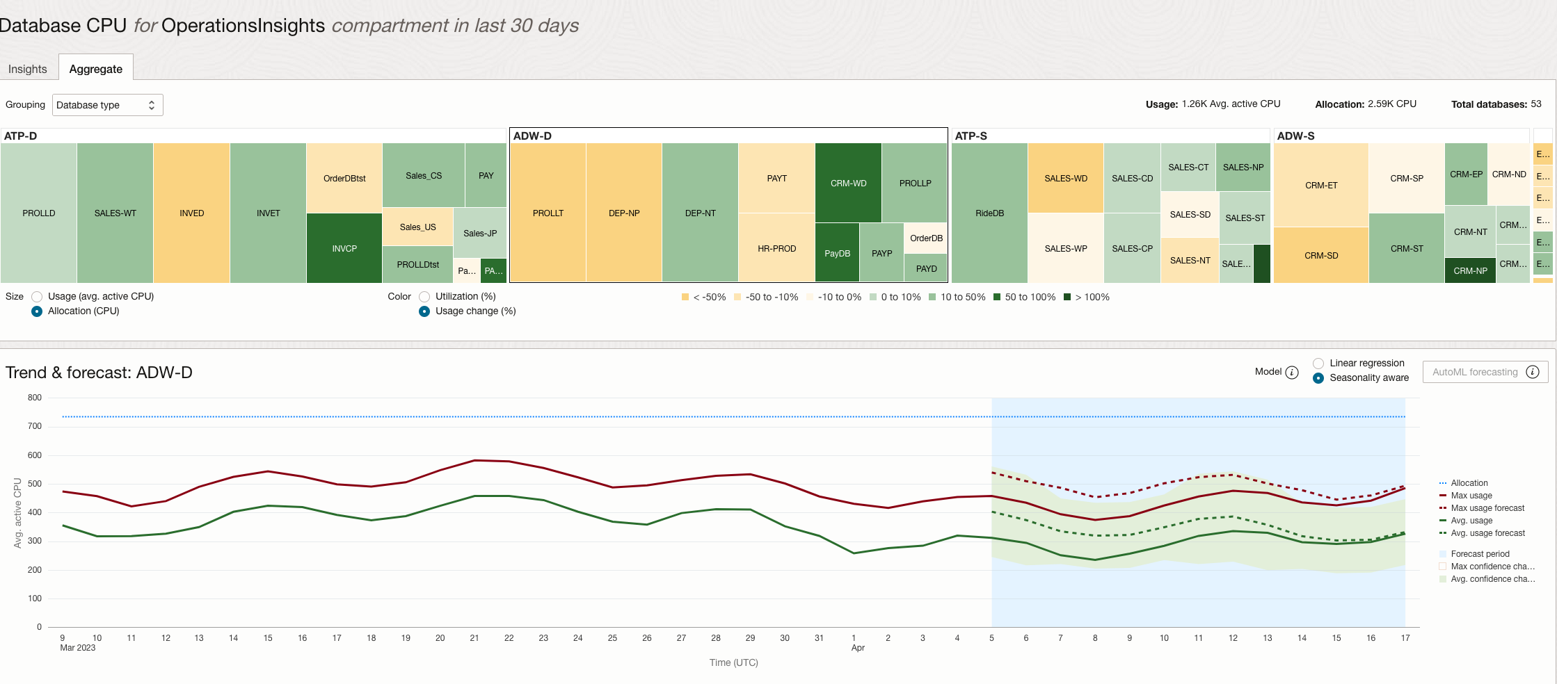
In the CPU Details Aggregate page pictured above, Treemap sizing is by Max Allocation and coloring is by Usage Change (%). The database cells are grouped by Database Type, and the ADW-D group (Autonomous Data Warehouse - Dedicated) is selected.
We see that the trend and forecasts for ADW-D database Max and Avg CPU usage are pretty flat, and with relatively low variance. However, within the group there are four databases, and two are growing in usage (green shades) and two are shrinking in usage (amber shades.) In addition, we can easily see that ADW-D databases account for approximately ¼ of the total database CPU allocation across the compartment. We can also drill down individually on the growing and shrinking databases within the group to analyze their specific trends and forecasts.