Other Tasks
Here are some topics on various other tasks in the Visual Flow Designer, including user authentication, auto-numbering, resource bundles, creating input forms, creating custom parameters, and importing and exporting flows.
User Authorization
At certain points in a flow, you may wish to enforce user authorization.
You accomplish this by doing the following:
- On the states where you want to enforce authorization, set the Requires
Authorization property to
True. This property is on the General tab of the state's property inspector.If a user that reaches such a state hasn't authorized yet, the Authorize using OAuth state is invoked, and then the flow invokes the state that required authorization.
- Create an authorization component and map it to the flow's Authorize
User standard transition event:
- Select the flow and then select the flow's Flow tab.
- Double-click the Events tile for the flow to expand it.
- Mouse over the Authorize User tile, click the ellipsis (…) button that appears, and select Add State.
- From the Security category of the template picker,
select a component, provide a name for the state, and click
Insert.
See Security Templates for details of each of the available templates.
- In the component's property inspector, configure the component's properties, including its transition actions.
Auto Numbering Response Items
You can use the auto-numbering feature to prefix buttons and list options with numbers in your responses.
When users can’t use tap gestures, they can still trigger the button’s postback actions by entering a number. This feature is particularly helpful for text channels.
You configure auto numbering at the skill level.
To configure auto numbering:
- In the left navigation of the skill, select
 .
.
- Select the Configuration tab.
- Set the value of Enable Auto Numbering on Postback Actions in Task
Flows.
If you want to turn on auto numbering for all channels, set the value to true.
If you want to turn auto numbering on only for certain channels, provide an expression to determine which channels will get auto numbering. For example, to turn on auto numbering only for Twilio channels, you would enter:
${(system.channelType=='twilio')?then('true','false')}
Limiting the Number of User Prompts
You can keep ensure that users don't get stuck on a step in a dialog flow by configuring that component to limit the number of times it repeats a prompt to the user.
The maxPrompts property limits the number of times that Common
Response components can prompt the user when they can’t match the input value to any of the
values defined for the entity or input type that’s referenced by the variable
property. You can use this property to prevent your dialog from going in circles when users
repeatedly enter invalid values. You can set the maximum number of prompts using an integer .
The dialog moves onto the next state if the user enters a valid value before reaching this
limit. Otherwise, the dialog transitions to the state defined by the cancel
action.
Resource Bundles and the Visual Flow Designer
You can use resource bundles to store any user-visible strings that you add to your dialog flow.
You reference resource bundle message keys through the variable
rb. A reference to a simple resource bundle message takes either of
the following two forms:
${skill.system.rb.RB_ENTRY_NAME}${rb.RB_ENTRY_NAME}
Tip:
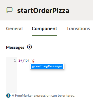
Autocompletion helps you select the resource bundles referenced in Apache FreeMarker expressions.Modify a Resource Bundle Entry
- In the skill, click
 to open the Resources Bundle.
- Select the Configuration tab.
- Using the Filter field, navigate to the entry that you want to update.
- Mouse over the value for the key and select the
 icon that appears.
- In the Text field, enter the updated message.
- Click Update Entry.
User Input Form Messages
In dialog flows, you can also create create input forms.
Sometimes an input form is the quickest and least error-prone way of collecting user
information. Rather than a subjecting users to a volley of questions, your skill can guide
users to providing valid input by sending them forms that contain input elements like text
input fields, time and date pickers and toggle switches.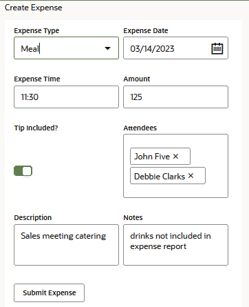
Description of the illustration editable-form-example.png
- From the Add State dialog, choose User Messaging > Create Tables and Forms. Then choose Create Input Form.
- To create the form's layout, actions and editable and read only fields, first click
Edit Response
            Items
and then edit theResponseItemsmetadata template. In this case, the template is for theeditFormresponse item.responseItems: - type: editForm title: Input Form formColumns: 2 items: - autoSubmit: false displayType: textInput defaultValue: "${(submittedFields.value.myText)!''}" multiLine: false minLength: 5 name: myText label: Text placeholder: Enter free text clientErrorMessage: Field is required and must be between 5 and 50 characters required: true maxLength: 50 - validationRegularExpression: "^[a-zA-Z\\s]*$" autoSubmit: false displayType: textInput defaultValue: "${(submittedFields.value.myTextArea)!''}" multiLine: true name: myTextArea label: Text Area placeholder: Enter free text clientErrorMessage: Numbers are not allowed - autoSubmit: false displayType: datePicker minDate: "1970-01-01" defaultValue: "${(submittedFields.value.myDate)!''}" name: myDate maxDate: "${.now?iso_utc[0..9]}" label: Date placeholder: Pick a date in the past clientErrorMessage: Date is required and must be in the past. required: true - autoSubmit: false maxTime: "12:00" displayType: timePicker minTime: "00:00" defaultValue: "${(submittedFields.value.myTime)!''}" name: myTime label: Time placeholder: Pick a time in the morning clientErrorMessage: Time must be in the morning. required: false - autoSubmit: false displayType: numberInput minValue: 5 maxValue: 500 defaultValue: "${(submittedFields.value.myNumber)!''}" name: myNumber label: Number placeholder: Enter a number between 5 and 500 clientErrorMessage: Number is required and must be between 5 and 500. required: true - autoSubmit: false displayType: singleSelect defaultValue: "${(submittedFields.value.mySingleSelect)!''}" name: mySingleSelect options: - label: Label 1 value: Value 1 - label: Label 2 value: Value 2 - label: Label 3 value: Value 3 layoutStyle: list label: Single Select clientErrorMessage: Field is required required: true - autoSubmit: false displayType: multiSelect defaultValue: "${(submittedFields.value.myMultiSelect?join(','))!''}" name: myMultiSelect options: - label: Label 1 value: Value 1 - label: Label 2 value: Value 2 - label: Label 3 value: Value 3 layoutStyle: list label: Multi Select clientErrorMessage: Field is required required: true - displayType: toggle defaultValue: "${(submittedFields.value.myToggle)!'true'}" name: myToggle labelOn: "Yes" label: Toggle valueOff: "false" labelOff: "No" valueOn: "true" actions: - label: Submit type: submitForm channelCustomProperties: - channel: "${system.channelType}" properties: replaceMessage: "${system.message.messagePayload.type == 'formSubmission'}"
The Edit Forms Metadata Template
editForm response type:
- The properties provided for the
items,actionsandchannelCustomPropertiesare all specific to theeditFormMessagePayloadobjects. Among other things, this payload contains descriptions of the overall layout of the input form message that's received by the user, the form fields (both read only and editable), and channel-specific customizations for platform-specific UI rendering and form submission behavior. - For each item and within the
actionsnode, the template references a flow-level variable calledsubmittedFieldsthat holds the user input. This is a map variable that's generated when you add an inputForm state to the dialog flow.Note
Depending on your needs, you can reference individual variables or a composite bag variable in place of thesubmittedFieldsvariable. items:- While the template provides properties for the editable fields (single and multiselect fields, date and time pickers, the number input field and the toggle switch), you can also add items for the text and link read only elements.
- The editable fields share a set of common properties, including the
autoSubmitproperty. This is an optional property, but enabling it (autoSubmit: true) allows the form to submit a field value before the user has actually submitted the entire form. You can use this property for interdependent fields within your form. For example, you can set this property when the display of one field depends on a value entered in another field, or when a value set for one field restricts the input allowed in another field.Note
Microsoft Teams does not supportautoSubmit. - The optional
clientErrorMessageproperty sets the field-specific error message that displays when there is limited client-side validation or when client-side validation fails. For example, for messages sent through the Slack channel, this property is only supported when the form is within the conversation page. It does not display when the form message is in a modal dialog.Note
This property is mainly intended for Microsoft Teams adaptive cards, which limits you to use a single message for all different field-level errors.
actions- Within this node, the template describes the form submission actions that submit the user input through theFormSubmissionMessagePayload.channelCustomProperties- To support a multi-mode experience, where the user might use combinations of text and voice to fill in the form fields before submitting the form, the template includes thereplaceMessageproperty configuration that instructs the client channel to update the current input form message instead of adding a new input form to the conversation.
Input Form Fields
| Element | Example | Sample Code: Map Variable (submittedFields) | Editable? |
|---|---|---|---|
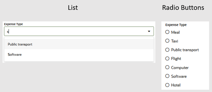
| Single-select List | Allows users to search for, and select, an item from
a predefined list. You can style this component as a list of options
which users can query for, and select. |
|
Yes |
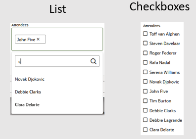
| Multiselect List | A list that supports multiple selections. You can
style this component as a pick list that users can filter and select
from, or as a set of checkboxes. |
|
Yes |
| Time Picker | Allows the user to enter a time value within a
specified range. The component's maxTime and
minTime properties validate the user
input. |
|
Yes |
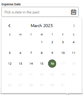
| Date Picker | A field with a drop down calender that allows users
to select a day, month, and year. The component's
maxDate and minDate properties
validate the user input. |
|
Yes |
| Number Input | Allows the user to enter a number value. The
minValue and maxValue
properties validate the user input. |
|
Yes |
| Text Input | Allows the user to enter a text value. |
|
Yes |
| Toggle | Presents a toggle switch (or a radio button grouping,
depending on the channel) for two options. |
|
Yes |
| Text | Read only inline text |
|
No – Read only |
| Link | An inline link |
|
No – Read only |
| Action | One of the Action types (link, button, or icon). | In the following snippet, an action link is rendered,
when the value for the selectedOrder variable is
slotted with the value of the item
row. |
No – Read only |
Custom Parameters
In your skill, you can define customer parameters to be referenced from dialog flows.
After you have published the skill, you can change the values of these parameters (though you can not change other parameter details or add or delete parameters).
Custom parameters are exposed as skill.system.config variables for
use in the dialog flow definition. For example, a custom parameter named
faHostName would be accessed with the following expression:
${skill.system.config.faHostName}If you want to be able to set the value for a skill's parameter in the digital assistant that you add the skill to, preface the parameter name with da. (including the dot (.)). For example, you could use da.faHostName as the name for a parameter for a host name.
Using this approach, you can define parameters with the same names in multiple skills, add all of those skills to a digital assistant, and then set the values for the shared parameters in one place in the digital assistant.
To access a parameter from a custom component, define an input parameter in the custom component and then pass the value of the skill parameter to it.
You can't set the values of custom parameters (or any other variables prefixed with
skill.system.config directly
in the dialog flow or in custom components.
Create a Custom Parameter
- Click
 to open the side menu, select Development > Skills, and select your skill.
- In the skill’s left navigation, click
 .
.
- Click the Configuration tab.
- Click New Parameter and fill in the fields of the dialog that appears.
Secure Parameters
If your skill relies on a parameter, the value of which you don't want to be visible to others who are developing that skill or versions or clones that skill, you can designate that parameter as a secure parameter. Anybody who then navigates to the Settings page in the skill can see the name of the parameter, but not the value.
If you export the skill, the value of the parameter is not included in the export.
To create a secure parameter:
- In the Create Parameter dialog, select Secure from the Type dropdown.
Modify the Value for a Custom Parameter in a Published Skill
Once you have published a skill, you can't add or delete custom parameters, but you can change their values. To do so:
-
Click
 to open the side menu, select Development > Skills, and select your skill.
-
In the skill’s left navigation, click
 .
.
- Select the Configuration tab.
-
Select the parameter, click Edit, and enter the updated value.
If you have added a skill with a parameter that is prefaced with
da. to a digital assistant and you want to update the value that is used by the digital assistant, you need to do so in the digital assistant. Otherwise, the digital assistant will keep using the value that the parameter had at the time when it was added to the digital assistant. Changing the value in the skill will only affect the skill if it is used standalone or if it is later added to a different digital assistant.
Set the Value for a Parameter in Digital Assistant
After a skill has been published and has been added to a digital assistant, you can set the value in the digital assistant for any of the skill's parameters that are prefixed with da. (including the period (.)).
If a "da." parameter with the same name is defined in multiple skills in the digital assistant, the value of that parameter is shared between the skills in the digital assistant.
To set the value for a parameter in a digital assistant:
- Click
 to open the side menu, select Development > Digital Assistants, and select your digital assistant.
- In the digital assistant's left navigation, click
 .
.
- Select one of the skills that uses the parameter.
- Scroll down to the Parameters section of the page and enter a value for the parameter.
The updated parameter value will be applied for all skills that use the parameter.
Import and Export Flows
You can import and export Visual Mode dialog flows using the Import Flow and Export Selected Flow options from the More menu.
Export Flows
-Flow (
PizzaSkill-pizza.ans.proc.veggiePizza-Flow.yaml, for example). Its YAML
syntax conforms to Visual Dialog Mode, not the OBotML written for skills created in the YAML
mode. When you export a flow, you export this document only. It will not be accompanied by any
of the following dependencies, even if they are referenced.
- The security service referenced by security component states.
- Services for various service integration states
- Translation services
- Intents, entities, resource bundles
- Referenced task flows
You can export any flow except for the main flow.
name: "WineryChats"
trackingId: "D6BFE43B-D774-412A-91F6-4582D04B3375"
type: "task"
version: "2.0"
interface:
  returnActions:
  - "done"
variables:
- name: "redWineCard"
  type: "map"
  system: false
defaultTransitions:
  actions:
    system.outOfOrderMessage: "outOfOrderMessageHandler"
    system.startTaskFlow: "buildRedWineMenu"
states:
  buildRedWineMenu:
    component: "System.SetVariable"
    properties:
      variable: "redWineCard"
      value:
        Cabernet Sauvignon:
          image: "https://cdn.pixabay.com/photo/2016/05/24/16/16/wine-1412603__340.jpg"
          price: 35
          description: "Flavor of dark fruits like black cherry and blackberry along with a warm spice, vanilla and black pepper"
          title: "Cabernet Sauvignon"
...
Import Flows
You can import a flow by clicking More > Import
flow and then browsing to, and selecting, a YAML document formatted for
the Visual Dialog Mode. These flows can be the YAML documents generated when you export
a dialog flow (the ones with names formatted as <skill name> - <flow name>
-Flow.yaml ), or they can be the YAML files located in the
dialogs folder of an exported ZIP file for a skill built using
Visual Dialog Mode. You can't import an OBotML document directly. You must migrate the skill first.
- You can't import a main flow (the
System.MainFlow.yamlfile located in thedialogsfolder of an exported ZIP file for a Visual Dialog Mode skill. - You can't import a flow that already exists in the skill or in your
instance. If the flow already exists, you can upload the YAML document by
changing the value for the
namenode.
However, you may instead want to duplicate the flow (Menu > Duplicate Selected Flow) rather than edit the YAML.name: "WineryChats" trackingId: "D6BFE43B-D774-412A-91F6-4582D04B3375" type: "task" ...

